Discussion:
Xubuntu 16.04 default desktop
Makay József
2016-03-08 11:16:35 UTC
Permalink
Hi,

My name is József Makay – editor-in-chief at Androbit.net, exUbuntu,
exOpenSUSE, exDebian, now Xubuntu user. If it's possible I want to share
my opinion about Xubuntu desktop.

Xubuntu's Xfce deskop is basically great but there are some (three)
little thing with you can improve the user experience.


1. Panel on the top is very annoying when you are using a browser
because tabs and task bar are too close to each other. Please move to
bottom, million Windows-users will love it.

2. Whisper launcher button is too small. Please, give a name
(Applications) for this button and change the icon to a smaller, white icon.

3. Change the wallpaper. Everything is better than the current default.


Loading Image...
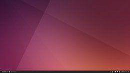
This is my Xubuntu desktop, I hope it will be inspiration for you.


Have a nice day,
József Makay


*Makay József* (editor-in-chief)
https://androbit.net
***@androbit.net
+36-70-417-6290

Confidentiality Note: This e-mail is intended only for the person(s) or
entity(ies) to which it is addressed and may contain information that is
privileged, confidential or otherwise protected from disclosure. Any
review, retransmission or other use of, or taking of any action in
reliance upon this information by anyone other than the intended
recipient(s) is prohibited. If you have received this e-mail in error,
please notify the sender immediately and destroy the entire message.
Disclaimer: Any e-mail messages from Androbit.net shall not be binding
nor construed as constituting any obligation on the part of
Androbit.net, unless Androbit.net and the recipient(s) have explicit
otherwise agreed upon in writing.
Pasi Lallinaho
2016-03-08 14:45:48 UTC
Permalink
Hello József,

and thanks for your interest – all comments are welcome. Find comments
inline.
Hi,
My name is József Makay – editor-in-chief at Androbit.net, exUbuntu,
exOpenSUSE, exDebian, now Xubuntu user. If it's possible I want to
share my opinion about Xubuntu desktop.
Xubuntu's Xfce deskop is basically great but there are some (three)
little thing with you can improve the user experience.
1. Panel on the top is very annoying when you are using a browser
because tabs and task bar are too close to each other. Please move to
bottom, million Windows-users will love it.
First of all, it's too late in the Xenial cycle to land this kind of
changes; the UI freeze is on Thursday, and changing default
configuration like the panel locations would require consulting the
whole team.

When you say the tabs and the panel are too close, what do you mean? Is
it an accessibility issue, eg. you can't see the difference between the
two? Or is it mostly an usability issue, meaning you will accidentally
click the other when you want to click the other? I'm not sure if I
would consider it either, but if a large group of users think it is,
then we should likely reconsider the panel location.

For what it's worth, we won't change our configuration because "million
Windows-users would love it". There needs to be good argumentation as to
why something is changed; while Windows is something most people have
used, it doesn't mean they have done everything "right".
2. Whisper launcher button is too small. Please, give a name
(Applications) for this button and change the icon to a smaller, white icon.
Too small for what? Is this an accessibility or an usability issue?

There has been discussions about this before, and the team has decided
to use the "icon only" style. It can be considered for future releases
if it seems like there is a good argument for changing it. Again, it's
too late to land the change in the Xenial cycle though.

For both of the issues above, would you consider it's fairly easy to do
the configuration change yourself? Or in other words, would say one of
your arguments for changing the defaults is that it is too hard to
modify the defaults? One thing we can do to make it easier is to cover
the topic in the documentation.
3. Change the wallpaper. Everything is better than the current default.
I'm not sure which wallpaper you are referring to (maybe it's the brown
"development" wallpaper?). If you are referring to something else, I
would happily hear why do you think the wallpaper is "worse than
anything else".

We have a new wallpaper landing, hopefully before the UI freeze on
Thursday. I hope we won't be letting your expectations down and create a
worse wallpaper than the current one.

Ultimately, wallpapers are a matter of taste – some like them tuned down
and in the background, some like vibrant colors. What we're offering is
just something we consider a good default. If you don't like it, it's
easy to change as well.


Finally, if you are interested in working with the configuration
settings and artwork direction of Xubuntu in the future, keep on reading
this list and take part in the discussions on the development IRC
channel #xubuntu-devel on Freenode.

As I said before, we happily hear feedback from users, but to make
changes reality, the Xubuntu team needs to be convinced that the changes
are for the better. This also needs to happen well before the release to
actually have time to discuss and decide on things.

Cheers,
Pasi
--
Pasi Lallinaho (knome) » http://open.knome.fi/
Leader of the Shimmer Project » http://shimmerproject.org/
Ubuntu member, Xubuntu Website lead » http://xubuntu.org/
Arkadiusz Panek
2016-03-08 12:45:58 UTC
Permalink
Hi József,

I would like to share my view on what you write, if I may.
It is all a matter of taste, really.

1. I personally like the top panel for a few reasons - eg. I found that
looking more often at the top of the screen is good for my neck :-) Tabs
and task bar being close may be more intuitive - you just move up to change
either a tab or a task.

2. Giving a name to whisker takes more space in the panel - not necessarily
a good thing. I don't really need the "menu" label to know where to find
the menu ;-)

3. As for the wallpaper - it's like asking which colour looks nicest...

Fortunately Linux gives the user a number of possibilities to tweak their
system and as long as it is a matter of a few clicks, I don't really see a
problem there.

Best regards,
Arek
Post by Makay József
Hi,
My name is József Makay – editor-in-chief at Androbit.net, exUbuntu,
exOpenSUSE, exDebian, now Xubuntu user. If it's possible I want to share my
opinion about Xubuntu desktop.
Xubuntu's Xfce deskop is basically great but there are some (three) little
thing with you can improve the user experience.
1. Panel on the top is very annoying when you are using a browser because
tabs and task bar are too close to each other. Please move to bottom,
million Windows-users will love it.
2. Whisper launcher button is too small. Please, give a name
(Applications) for this button and change the icon to a smaller, white icon.
3. Change the wallpaper. Everything is better than the current default.
http://i.imgur.com/7zX4ETw.jpg
This is my Xubuntu desktop, I hope it will be inspiration for you.
Have a nice day,
József Makay
*Makay József* (editor-in-chief)
https://androbit.net
+36-70-417-6290
Confidentiality Note: This e-mail is intended only for the person(s) or
entity(ies) to which it is addressed and may contain information that is
privileged, confidential or otherwise protected from disclosure. Any
review, retransmission or other use of, or taking of any action in reliance
upon this information by anyone other than the intended recipient(s) is
prohibited. If you have received this e-mail in error, please notify the
sender immediately and destroy the entire message. Disclaimer: Any e-mail
messages from Androbit.net shall not be binding nor construed as
constituting any obligation on the part of Androbit.net, unless
Androbit.net and the recipient(s) have explicit otherwise agreed upon in
writing.
--
xubuntu-devel mailing list
https://lists.ubuntu.com/mailman/listinfo/xubuntu-devel
Benoit THIBAUD
2016-03-08 12:28:32 UTC
Permalink
Hi József,
In the Settings Manager, you have an app: "*Xfce Panel Switch*" (don't
know if it was there in trusty??). You can save, export or import your
desktop settings. By default, you have a "redmond" flavor that put
straight away your panel at the bottom. You can start from it to
customize it. After you export the settings to an usb key, you can make
it work on any other xubuntu machine you want.

Whisper is really easy to customize with a right mouse click.

Wallpaper is not an issue either because you can fix it with a right
click on the desktop, > "desktop settings"...

If the config was too good at the first glance I shouldn't have found
out how easy it is to customize my xubuntu desktop!!

Have a nice day too,
Benoit THIBAUD
Hi,
My name is József Makay – editor-in-chief at Androbit.net, exUbuntu,
exOpenSUSE, exDebian, now Xubuntu user. If it's possible I want to
share my opinion about Xubuntu desktop.
Xubuntu's Xfce deskop is basically great but there are some (three)
little thing with you can improve the user experience.
1. Panel on the top is very annoying when you are using a browser
because tabs and task bar are too close to each other. Please move to
bottom, million Windows-users will love it.
2. Whisper launcher button is too small. Please, give a name
(Applications) for this button and change the icon to a smaller, white icon.
3. Change the wallpaper. Everything is better than the current default.
http://i.imgur.com/7zX4ETw.jpg
This is my Xubuntu desktop, I hope it will be inspiration for you.
Have a nice day,
József Makay
*Makay József* (editor-in-chief)
https://androbit.net
+36-70-417-6290
Confidentiality Note: This e-mail is intended only for the person(s)
or entity(ies) to which it is addressed and may contain information
that is privileged, confidential or otherwise protected from
disclosure. Any review, retransmission or other use of, or taking of
any action in reliance upon this information by anyone other than the
intended recipient(s) is prohibited. If you have received this e-mail
in error, please notify the sender immediately and destroy the entire
message. Disclaimer: Any e-mail messages from Androbit.net shall not
be binding nor construed as constituting any obligation on the part of
Androbit.net, unless Androbit.net and the recipient(s) have explicit
otherwise agreed upon in writing.
Michael Lueck
2016-04-09 15:16:09 UTC
Permalink
Greetings Makay,
1. Panel on the top is very annoying when you are using a browser because tabs and task bar are too close to each other. Please move to bottom, million Windows-users will love it.
haha... I liked the default layout of Xubuntu 12.04... looks like MacOS with bars on both the top and bottom.

With the one bar on the top only, seems like the direction has been to seek to clone the look of Windows Server 2008 instead.
2. Whisper launcher button is too small. Please, give a name (Applications) for this button and change the icon to a smaller, white icon.
I believe with Whisker you can also have text along side the icon. Yes, that is possible for Whisker: Right click an empty spot on the panel \ Panel \ Preferences \ Items \ double click on "Whisker
Menu" \ Panel Button - Display "Icon and Text"

I am thankful,
--
Michael Lueck
Lueck Data Systems
http://www.lueckdatasystems.com/
--
xubuntu-devel mailing list
xubuntu-***@lists.ubuntu.com
https://lists.ubuntu.com/ma
Loading...